
Introduction to Mixing Prints and Patterns
Mixing prints and patterns is an increasingly popular trend in both fashion and interior design, offering a vibrant way to express individual style and creativity. This concept involves the thoughtful combination of various patterns, such as stripes, florals, and geometrics, to create visually intriguing and dynamic looks. The art of melding different prints has gained substantial traction for its ability to infuse energy and personality into any outfit or living space, far beyond what solid colors can achieve. Once mastered, this skill can elevate your style to new heights, making your fashion statements and home decor truly distinct and personalized.
The key to successfully mixing prints lies in understanding balance, scale, and color harmony. While the prospect may initially seem daunting, adhering to a few guiding principles can result in stunning and cohesive combinations. In fashion, pairing a bold, busy pattern with a more subtle, complementary one can create a balanced yet striking ensemble. Similarly, in interior design, blending different patterned elements, such as throw pillows, rugs, and wallpaper, can add depth and interest to a room without overwhelming the senses.
One of the primary benefits of mixing prints and patterns is the flexibility it offers. With numerous patterns and designs available, you are not confined to a singular style. Instead, you can experiment with various combinations to match your mood, occasion, or the season. Mastery of this technique allows for endless creativity and ensures that your wardrobe or interior remains fresh and engaging.
Moreover, combining prints is an excellent way to rejuvenate existing pieces. By mixing and matching what you already own with newly acquired items, you can create fresh looks without the need for a complete overhaul. This practice not only enhances your style but also promotes sustainability through the maximization of existing resources.
In essence, mixing prints and patterns goes beyond mere aesthetic appeal; it is a testament to one’s ability to innovate and personalize their environment. As we delve deeper into this guide, you will discover practical tips and methods to seamlessly integrate this captivating trend into your daily life and spaces.
Understanding the Basics of Prints and Patterns
When it comes to the world of fashion, prints and patterns play a pivotal role in defining trends and personal styles. Each type of print carries a unique history and set of characteristics that make it visually appealing. From classic stripes to whimsical polka dots, each print can convey a specific aesthetic and mood.
Stripes
Stripes are perhaps one of the most enduring and versatile prints in fashion. Originating from maritime uniforms in the 19th century, stripes have evolved to symbolize both simplicity and sophistication. The alternating bands of contrasting colors create a visually stimulating effect that can either elongate or widen the appearance depending on their orientation. Whether it’s nautical navy and white or vibrant, multi-colored combos, stripes consistently add a timeless appeal to any outfit.
Polka Dots
Polka dots burst onto the fashion scene in the mid-19th century and quickly became associated with playful, youthful charm. Characterized by their repetitive round spots, polka dots offer a whimsical and cheerful element to clothing and accessories. They can range from small, subtle spots to large, bold circles, making them incredibly versatile for both casual and formal settings.
Florals
Floral prints have a rich history that spans cultures and centuries. Often inspired by nature, these patterns can evoke feelings of femininity, romance, and freshness. Whether rendered in delicate pastels or bold, vibrant hues, florals are a perennial favorite, often seen on everything from summer dresses to elegant evening wear. The complexity of floral designs, with their intricate layers and color combinations, makes them incredibly eye-catching and dynamic.
Animal Prints
Animal prints, such as leopard spots and zebra stripes, have long been associated with luxury and a touch of the exotic. These patterns mimic the natural markings of wild animals, adding an element of boldness and sophistication to fashion. Animal prints are versatile, capable of complementing both edgy, modern looks and classic, timeless ensembles. Their natural, irregular patterns add a textural depth that is distinct and visually interesting.
Geometric Shapes
Geometric patterns encompass a wide range of shapes and structures, from clean lines to complex tessellations. These prints often carry a modern, avant-garde vibe, making them a popular choice for those looking to make a contemporary statement. The precise and repetitive nature of geometric patterns creates a sense of order and symmetry, evoking a sense of harmony and balance in design.
Understanding the basics of prints and patterns helps in appreciating their unique attributes, enabling one to mix them with confidence and creativity. Each type, with its own rich history and visual appeal, offers infinite possibilities for crafting stylish, cohesive outfits.
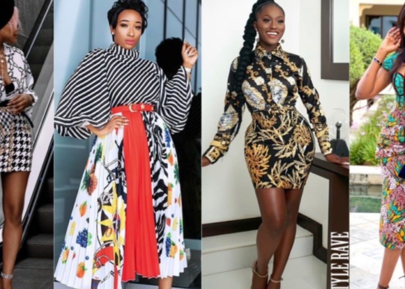
The Art of Coordination: Tips and Tricks
Successfully mixing prints and patterns requires an astute eye for coordination, striking a delicate balance between bold and subtle elements to create a harmonious ensemble. Let’s delve into some practical tips to help you master the art of print mixing.
First and foremost, balance is paramount. When combining bold prints, such as florals or geometric designs, with more understated patterns like stripes or polka dots, you’ll achieve a visually pleasant attire without overwhelming the senses. The key here is restraint. Allow one bold print to dominate while complementing it with a subtler pattern that offsets its intensity.
Another effective strategy is pairing patterns with similar color schemes. This approach creates visual cohesion, ensuring that the prints and patterns co-exist seamlessly. Harmonizing colors can bring a sense of unity to your look, even when the patterns differ significantly in style and structure.
Utilizing a common color to tie different patterns together is a powerful technique. This common hue acts as an anchor, fostering continuity and coherence across your mixed prints. Whether it’s a shared shade of blue, red, or green, the repeated color intercepts any potential discord, bringing a more polished and orchestrated feel to your outfit.
Proportion and scale are crucial considerations in print mixing. Ensuring that the size of the patterns works well together directly influences the overall aesthetic. Generally, large prints paired with smaller, more delicate patterns can help in balancing visual weight. For example, a large floral skirt paired with a delicate polka dot blouse can create a well-proportioned look, avoiding any overpowering effect.
By following these tips, you can confidently mix prints and patterns, creating outfits that are both eye-catching and well-coordinated. Balancing boldness, harmonizing color schemes, using a unifying color, and maintaining proportion and scale are your key tools for mastering print mixing like a pro.
Creating Balance with Color
Color plays a pivotal role when it comes to mixing prints and patterns harmoniously. Mastering the art of leveraging complementary and analogous color schemes can significantly elevate your styling game. Complementary colors, which sit opposite each other on the color wheel, such as blue and orange or red and green, create a striking contrast that adds vibrancy without overwhelming the senses. Conversely, analogous colors, situated next to each other, like blue, blue-green, and green, offer a more cohesive and serene effect, ideal for creating a balanced look.
Neutral tones are the unsung heroes when mixing prints and patterns. They provide the necessary canvas that grounds your outfit, allowing the more dynamic patterns to shine without clashing. Shades like beige, gray, and white act as buffers and can be seamlessly woven into different prints, providing a visually restful element that maintains harmony. For instance, pairing a bold striped navy top with a floral skirt can be effortlessly mediated by introducing a neutral beige cardigan or accessories.
Avoiding clashing colors is paramount. While it might be tempting to experiment with an array of vivid hues, a thoughtfully curated palette ensures a polished, cohesive look. Successful color combinations should enhance the overall aesthetic rather than create a visual overload. A classic example is combining polka dots in muted tones with soft pastel plaids. Similarly, pairing black and white polka dots with a red plaid skirt can create a timeless yet modern ensemble.
Applying these principles, one could experiment with a monochromatic scheme, using different shades of the same color within various patterns. For example, incorporating light blue gingham with navy blue stripes can be both subtle and sophisticated. Understanding and implementing these color techniques will undoubtedly aid you in mixing prints and patterns like a pro.
Mixing Textures and Fabrics
When it comes to mixing prints and patterns, the role that texture and fabric play cannot be overstated. The choice of material can either harmonize or clash with the prints in question, thereby influencing the overall aesthetic balance. Different fabrics bring their unique characteristics to the ensemble, dictating whether the combination of prints achieves cohesion or ends up looking chaotic.
For instance, pairing a delicate silk blouse with a chunky knit sweater can create a pleasing contrast both visually and texturally. The smooth, glossy surface of the silk juxtaposed with the rough, tactile element of the knit adds layers of interest. Conversely, attempting to combine two heavily textured fabrics, such as a tweed jacket and corduroy pants, can result in an overpowering look. Hence, understanding the interplay between prints and textures is essential to masterful pattern mixing.
Some guidelines to follow while mixing textures and fabrics include opting for materials that complement rather than compete with each other. Lightweight fabrics like chiffon or linen work well with heavier textiles such as wool or denim. This not only ensures a balanced visual impact but also enhances the overall comfort and practicality of the outfit.
Layering different fabrics goes beyond simply pairing textures. It’s about strategically positioning various materials to add dimensionality to your ensemble or interior space. For example, in fashion, layering a lace camisole under a leather jacket can introduce an edgy yet feminine dynamic to the look. Similarly, in interior design, juxtaposing a velvet throw against a cotton sofa can create a rich, inviting atmosphere.
Ultimately, understanding how different textures and fabrics interact can elevate your ability to mix prints and patterns like a professional. Through mindful selection and thoughtful layering, you can add depth and complexity to any outfit or room, transforming it into a cohesive, aesthetically pleasing masterpiece.
Iconic Inspirations and Case Studies
Throughout fashion and interior design history, the mastery of mixing prints and patterns has been tried and tested by numerous designers and decorators. Their bold choices and intricate designs have shown us that when done correctly, these elements can create visually stunning outcomes. Notable figures such as Diane von Fürstenberg, Vivienne Westwood, and interior decorator Kelly Wearstler have demonstrated unrivaled expertise in this area.
Diane von Fürstenberg is renowned for her iconic wrap dresses that often combine geometric prints with bold colors, transforming everyday attire into statement pieces. Her designs exemplify the harmony that can be achieved through thoughtful pattern pairing, where no element overshadows the other, creating a balanced yet dynamic look.
Vivienne Westwood’s work in punk fashion has pushed the boundaries of traditional print mixing. Often, she juxtaposes tartans, florals, and polka dots within a single outfit. One of her notable examples is the classic punk era dress that combined tartan with zebra print. Her approach involves considering scale and color coordination; despite the seemingly chaotic blends, the results are cohesive and harmonious.
In the realm of interior design, Kelly Wearstler’s eclectic style sets her apart. Her projects often feature spaces where different patterns coexist beautifully. A standout case study is her redesign of the Avalon Hotel in Beverly Hills. Here, she mixed geometric floor tiles with psychedelic wallpapers and eclectic upholstery, each element distinct yet complementary. The key to her success is her meticulous attention to the scale and color palette, ensuring that the room feels rich and complete rather than cluttered.
These experts teach valuable lessons in the art of mixing prints and patterns. Whether in fashion or interior design, the key to success lies in careful planning and consideration of elements like scale, color coordination, and balance. By studying their work, we can glean insights into creating our visually stimulating combinations without losing cohesion or harmony.
Common Mistakes to Avoid
When delving into the art of mixing prints and patterns, there are several pitfalls that enthusiasts must conscientiously avoid to achieve a harmonious, elegant ensemble. The allure of combining various designs can quickly turn into a minefield if certain guidelines are disregarded.
One prevalent mistake is overloading on prints, where multiple bold patterns are haphazardly combined. This approach can overwhelm the senses, leading to a chaotic appearance rather than a stylish one. To avoid this, it is crucial to anchor your look with a single, dominant print and use other designs as accents. This helps to create a focal point and ensures the ensemble remains visually coherent.
The importance of scale also cannot be overstated. Ignoring how various prints scale relative to one another can result in a disjointed look. Combining a large floral print with a smaller geometric pattern can offer a more balanced contrast, allowing each to stand out without clashing. Conversely, pairing two similarly scaled prints can appear cluttered. Aim to contrast scales thoughtfully to maintain aesthetic harmony.
Color balance is another critical factor often neglected. A well-coordinated color palette ties together disparate patterns and creates a visually appealing arrangement. When integrating multiple prints, ensure that there’s a common color thread that unites them. Opting for complementary or analogous colors can further elevate your outfit’s cohesion, lending it a polished look.
In navigating these common pitfalls, one should always remember that the ultimate goal is to achieve a cohesive and stylish composition. By maintaining a mindful approach to print selection, scaling, and color coordination, you can confidently mix prints and patterns like a pro, ensuring each ensemble exudes both creativity and refinement.
Practical Application: DIY Tips and Projects
Incorporating mixed prints and patterns into your fashion or home decor can be a delightful way to express your style. For those ready to embark on their own design journey, here are some useful DIY tips and projects to get you started.
An accessible home decor project is creating patterned throw pillows. Begin by selecting fabrics in different prints such as florals, stripes, or geometric designs. Ensure at least one color unifies the prints for a cohesive look. Cut each fabric to the pillow’s size plus an inch for seam allowance. Sew the fabrics together, leaving one side open for stuffing. After adding the filling, close the seam, and you’ll have a unique throw pillow that adds character to any room.
If fashion is more your interest, consider assembling an outfit with mixed prints. Start with one statement piece, like a plaid blazer. Pair it with a subtler pattern, such as a polka dot blouse. Balance the prints to avoid overwhelming the outfit opt for one bold pattern and one more subdued. Complement with solid-colored accessories to tie the look together.
To help with your combinations, use this checklist:
Identify a color palette: Choose prints that share one or two common colors.
Vary the scale: Mix large-scale patterns with smaller ones to create balance.
Use neutral bases: A neutral background can help mixed prints harmonize.
Test before you commit: Lay out the patterns together before sewing or wearing them.
Add solid pieces: Incorporate solid colors to break up and breathe space into the patterns.
By following these practical steps and projects, you can master the art of mixing prints and patterns, making your fashion or home designs a true reflection of your personal style.


Leave a comment
You must be logged in to post a comment.